Course Statistics
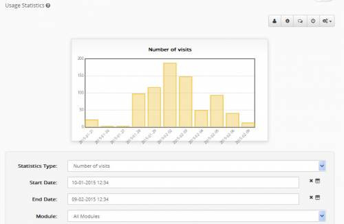
A course teacher can view the statistic information of a course by entering the course and clicking on “Usage Statistics” from the left menu. The screen that appears is presented in picture 2, which concerns the course use statistics. Precisely, you can see a diagram including either the approximate adjustment time of user presence to the system for a specific period of time. The diagram presented depends on the completed clues of the form below.
These are:
- Type of Statistics: It is either the number of income to a module, or the period of visit to the module. Statistical information is not totally accurate in the second case, since period of visit can be approximately counted, because of innate disablement of the http protocol.
- Starting date: The date that is the starting point of the period when the user wants to view statistics is filled in.
- Finishing date: The date that is the finishing point of the period when the user wants to view statistics is filled in.
- Module: If the user clicks on “All modules” they can see statistics of all the modules. Otherwise they can choose a specific one and create a diagram for it solely.
- Period of time: The way of grouping and presenting statistics is defined. Grouping can be daily, weekly, monthly, annual, or it is possible that they are presented gathered for the specific period of time that has been assigned before.
Since the user has selected the variables wished, they press the “Submission” button and the corresponding diagram appears on screen.
I should be noted that in case statistics are minimal for a certain set of variables (e.g. no one has visited the module for a long time), instead of a diagram what appears is a message informing for that case.
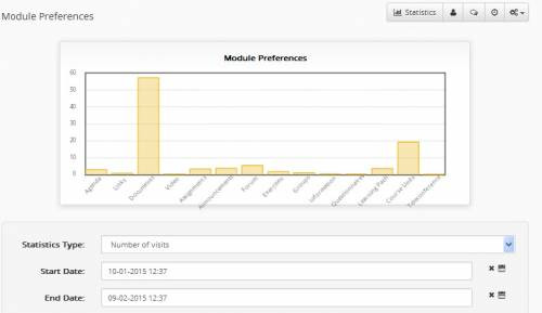
Another form of statistics that is offered to the teacher of a course is the “Module Preferences”, which concerns the user percentage of preference of the course to its modules. This information portrayed on a diagram-pie, and is like the one in picture 3. The user (teacher) can see the corresponding page by clicking again on the “Use Statistics” from the Administration Tools from the left menu and clicking on the “Module Preferences” from the statistics menu in the centre of the page.
The following parameters are filled in, in the corresponding form, so that a pie diagram can be created:
- Type of statistics: It is either the income to a module, or the visit time to it. It has to be noted that in the second case clues are not precise since visiting period is approximately accounted, because of innate disablement of the http protocol.
- Starting date: The date that is the starting point of the period when the user wants to view statistics is filled in.
- Finishing date: The date that is the finishing point of the period when the user wants to view statistics is filled in.
- User: If the user clicks on “All Users”, they will see all users’ preferences in total. Otherwise they can select a specific user from a list. Note that, because the number of users is big enough, you will be given the opportunity to choose the first letter of the user’s name, so as to limit the size of the list.
- Period of time: The way of grouping and presenting statistics is defined. Grouping can be daily, weekly, monthly, annual, or it is possible that they are presented gathered for the specific period of time that has been assigned before.
Finally, the teacher is given the opportunity to see harvest statistics of the course, older than eight months. Information older than eight months is only preserved in a monthly harvest form and is presented in a separate page for this reason. The teacher can have access to the page by clicking on “Use statistics” from the left menu and then clicking on the “Old Statistics view” in picture 2 screen.
In relation to the diagram appearance for old statistics, the following choices need to be filled in the form:
- Type of statistics: It is either the income to a module, or the visit time to it. It has to be noted that in the second case clues are not precise since visiting period is approximately accounted, because of innate disablement of the http protocol.
- Starting date: The date that is the starting point of the period when the user wants to view statistics is filled in.
- Finishing date: The date that is the finishing point of the period when the user wants to view statistics is filled in.
- Module: If the user clicks on “All modules” they can see statistics of all the modules. Otherwise they can choose a specific one and create a diagram for it solely.
Note that older than eight months statistics are stored in the database grouped for each month. This means that in the diagram they are presented in monthly groups as well.
In case statistics are minimal for a certain set of variables in the form, instead of a diagram what appears is a message informing for that case.

